
A picture is worth a thousand words:
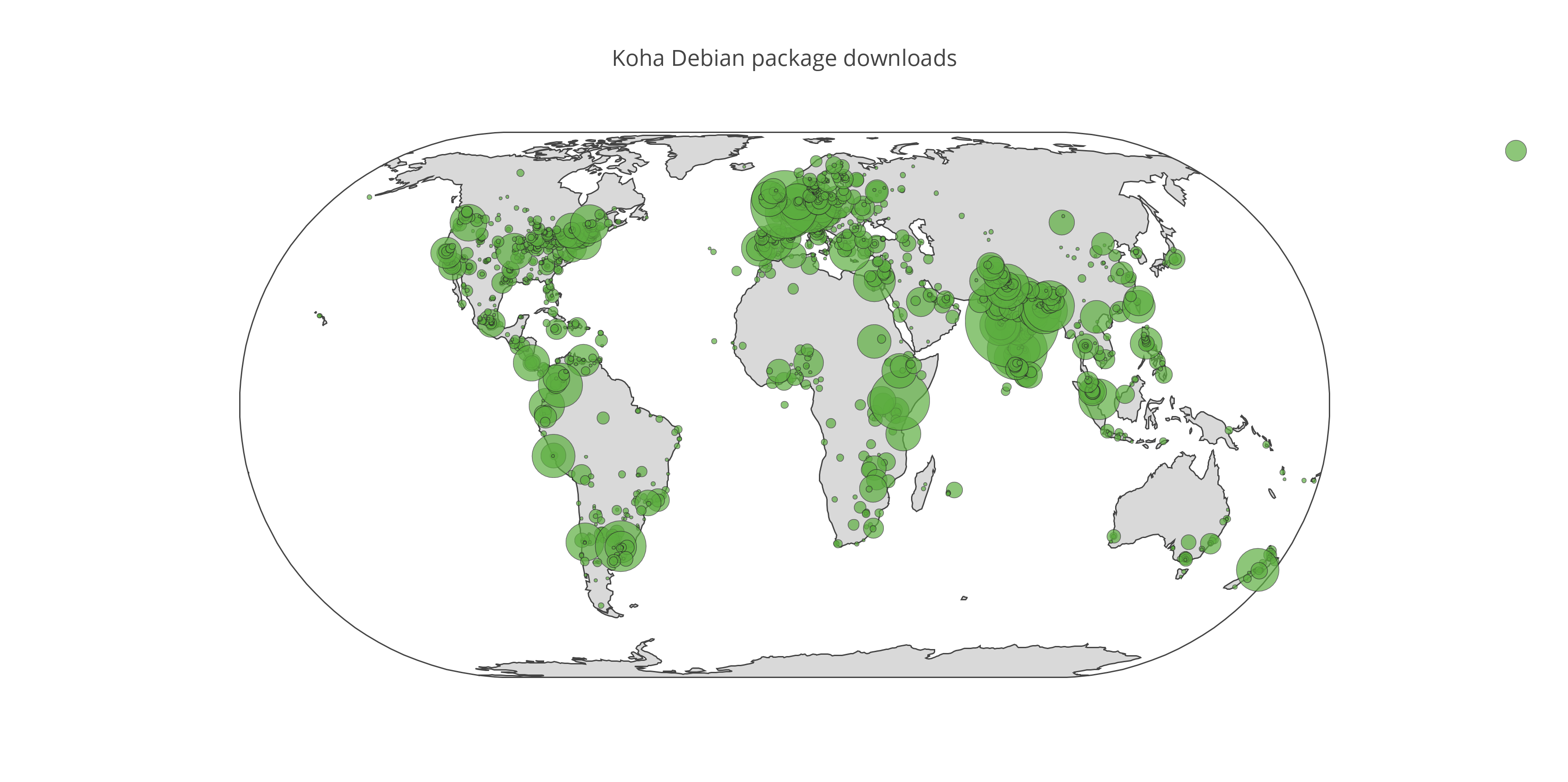
This represents the approximate geographic distribution of downloads of the Koha Debian packages over the past year. Data was taken from the Apache logs from debian.koha-community.org, which MPOW hosts. I counted only completed downloads of the koha-common package, of which there were over 25,000.
Making the map turned out to be an opportunity for me to learn some Python. I first adapted a Python script I found on Stack Overflow to query freegeoip.net and get the latitude and longitude corresponding to each of the 9,432 distinct IP addresses that had downloaded the package.
I then fed the results to OpenHeatMap. While that service is easy to use and is written with GPL3 code, I didn’t quite like the fact that the result is delivered via an Adobe Flash embed. Consequently, I turned my attention to Plotly, and after some work, was able to write a Python script that does the following:
- Fetch the CSV file containing the coordinates and number of downloads.
- Exclude as outliers rows where a given IP address made more than 100 downloads of the package during the past year — there were seven of these.
- Truncate the latitude and longitude to one decimal place — we need not pester corn farmers in Kansas for bugfixes.
- Submit the dataset to Plotly with which to generate a bubble map.
Here’s the code:
#!/usr/bin/python

# adapted from example found at https://plot.ly/python/bubble-maps/

import plotly.plotly as py
import pandas as pd

df = pd.read_csv('http://example.org/koha-with-loc.csv')
df.head()

# scale factor the size of the buble
scale = 3

# filter out rows where an IP address did more than
# one hundred downloads
df = df[df['value'] <= 100]

# truncate latitude and longitude to one decimal
# place
df['lat'] = df['lat'].map('{0:.1f}'.format)
df['lon'] = df['lon'].map('{0:.1f}'.format)

# sum up the 'value' column as 'total_downloads'
aggregation = {
    'value' : {
        'total_downloads' : 'sum'
    }
}

# create a DataFrame grouping by the truncated coordinates
df_sub = df.groupby(['lat', 'lon']).agg(aggregation).reset_index()


coords = []
pt = dict(
    type = 'scattergeo',
    lon = df_sub['lon'],
    lat = df_sub['lat'],
    text = 'Downloads: ' + df_sub['value']['total_downloads'],
    marker = dict(
        size = df_sub['value']['total_downloads'] * scale,
        color = 'rgb(91,173,63)', # Koha green
        line = dict(width=0.5, color='rgb(40,40,40)'),
        sizemode = 'area'
    ),
    name = '')
coords.append(pt)

layout = dict(
        title = 'Koha Debian package downloads',
        showlegend = True,
        geo = dict(
            scope='world',
            projection=dict( type='eckert4' ),
            showland = True,
            landcolor = 'rgb(217, 217, 217)',
            subunitwidth=1,
            countrywidth=1,
            subunitcolor="rgb(255, 255, 255)",
            countrycolor="rgb(255, 255, 255)"
        ),
    )

fig = dict( data=coords, layout=layout )
py.iplot( fig, validate=False, filename='koha-debian-downloads' )
An interactive version of the bubble map is also available on Plotly.
![]() Visualizing the global distribution of Koha installations from Debian packages by Galen Charlton is licensed under a Creative Commons Attribution-ShareAlike 4.0 International License.
Visualizing the global distribution of Koha installations from Debian packages by Galen Charlton is licensed under a Creative Commons Attribution-ShareAlike 4.0 International License.